Vue
element_ui
Icon图标
提供了一套常用的图标集合,直接用i标签集合class来使用:
<i class="el-icon-edit"></i>
<i class="el-icon-share"></i>
<i class="el-icon-delete"></i>
<el-button type="primary" icon="el-icon-search">搜索</el-button>
e-icon-iconName为官网定义的名称,直接去官网查找对应的图标,修改class属性即可。
Button按钮
是Element UI提供的一组常用的操作按钮组件,直接使用已经封装好的el-button,比如:
<el-button>按钮</el-button>基于button按钮,可以使用type、plain、round、circle属性对按钮进行修饰。
type设置按钮样式
<el-row>
  <el-button>默认按钮</el-button>
  <el-button type="primary">主要按钮</el-button>
  <el-button type="success">成功按钮</el-button>
  <el-button type="info">信息按钮</el-button>
  <el-button type="warning">警告按钮</el-button>
  <el-button type="danger">危险按钮</el-button>
</el-row>
plain可以减弱按钮的背景颜色效果![avatar1]
<el-row>
    <el-button plain>默认按钮</el-button>
    <el-button type="primary" plain>主要按钮</el-button>
    <el-button type="success" plain>成功按钮</el-button>
    <el-button type="info" plain>信息按钮</el-button>
    <el-button type="warning" plain>警告按钮</el-button>
    <el-button type="danger" plain>危险按钮</el-button>
</el-row>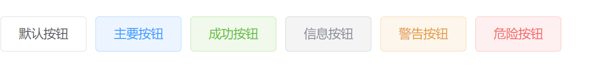
round 用来给按钮设置圆角
<el-row>
    <el-button round>圆角按钮</el-button>
    <el-button type="primary" round>主要按钮</el-button>
    <el-button type="success" round>成功按钮</el-button>
    <el-button type="info" round>信息按钮</el-button>
    <el-button type="warning" round>警告按钮</el-button>
    <el-button type="danger" round>危险按钮</el-button>
</el-row>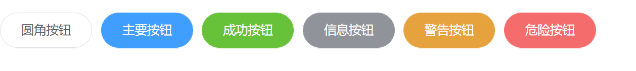
circle
<el-row>
    <el-button circle>圆角按钮 </el-button>
    <el-button type="primary" circle>主要按钮</el-button>
    <el-button type="success" circle>成功按钮</el-button>
    <el-button type="info" icon="el-icon-message" circle>信息按钮</el-button>
    <el-button type="warning" circle>警告按钮</el-button>
    <el-button type="danger" circle>危险按钮</el-button>
</el-row>